 Glyphfield
Accessibility
Use and extend Glyphfield with keyboard access, visible focus, semantic controls, reduced motion, contrast, and accessible exported artifacts.
Glyphfield combines ordinary document UI with direct-manipulation canvases and animated GPU output. Accessibility therefore has two boundaries: operating the Studio itself and making the exported artifact usable in its destination.
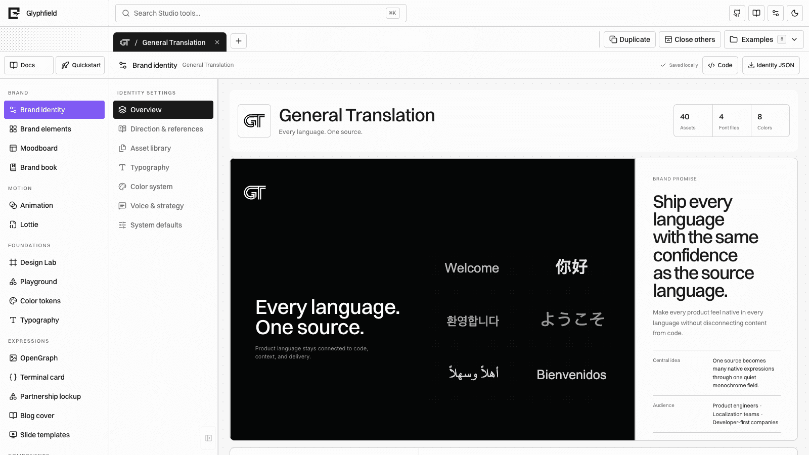
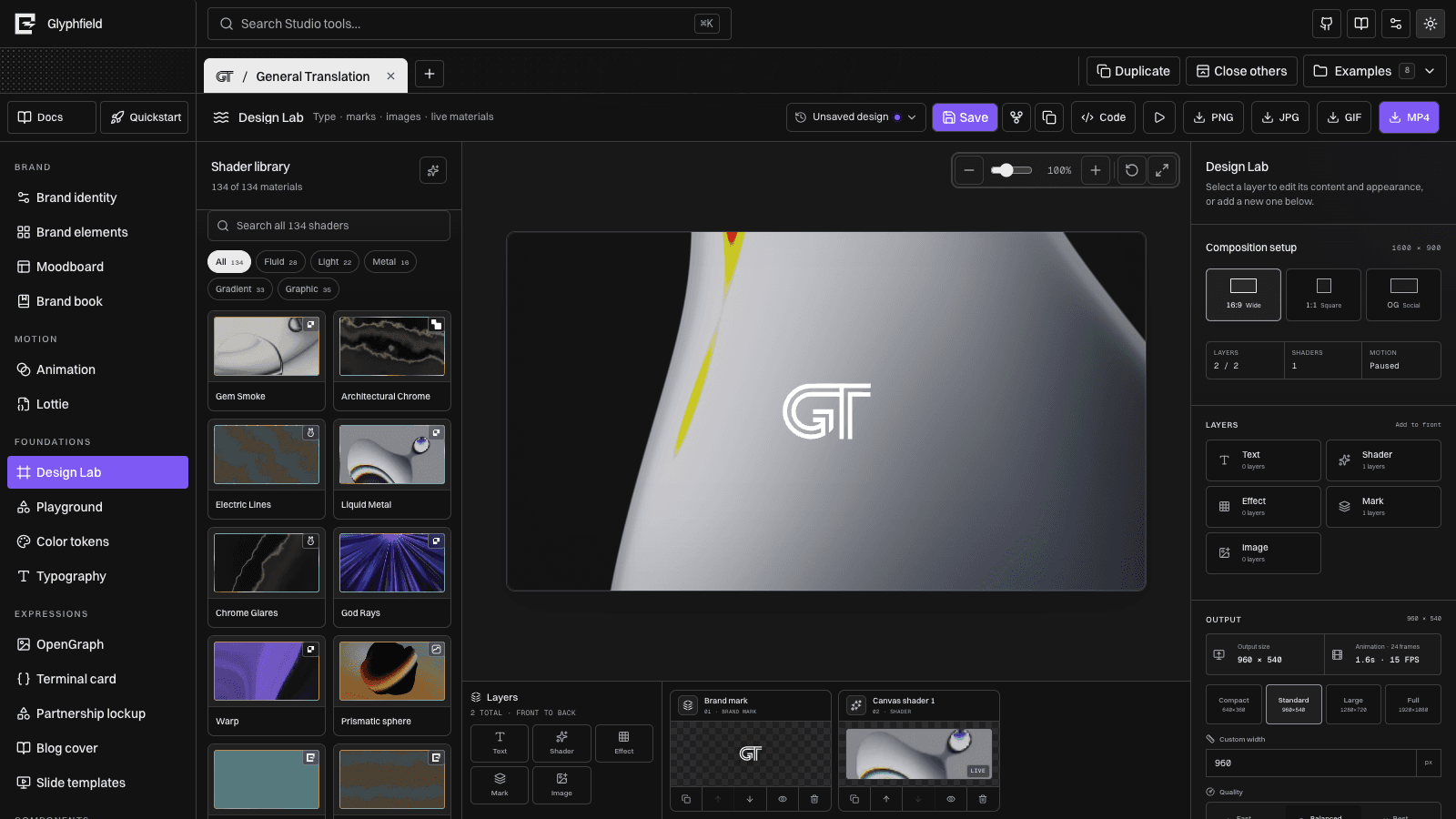
Interaction model
- Navigation, buttons, selects, fields, dialogs, drawers, tabs, and layer actions should expose visible labels or accessible names.
- The visual canvas is paired with a layer list and inspector so geometry and appearance are not controlled only by pointer gestures.
- Selected canvas items support arrow-key movement; Shift + arrow performs a larger nudge.
- Global Studio and documentation search expose keyboard shortcuts described in Keyboard shortcuts.
- Source-enabled tools provide a Code drawer for exact structured editing when direct manipulation is insufficient.
The current product is not represented as having completed a formal accessibility certification. Treat the guidance and checks below as the maintained contract and report gaps rather than assuming conformance.
Keyboard workflow
- Use Studio navigation or search to open a tool.
- Tab through the library, canvas-adjacent controls, inspector, and layer dock.
- Select a layer from the list when selecting it visually is difficult.
- Use arrow keys for precise movement and inspector fields for numeric changes.
- Open Code for exact source edits.
- Return focus to the invoking control when closing menus, dialogs, or drawers.
Do not make hover the only way to reveal a required action. Reordering, visibility, duplication, deletion, and export must remain reachable without dragging.
Focus and labels
Shared Studio components use semantic control roles and accessible labels as part of both human accessibility and Browser API automation. A missing label is therefore two bugs: assistive technology cannot name the control, and an agent cannot address it reliably through controls().
When adding or changing a control:
- Give icon-only controls an
aria-label. - Associate form labels with their input.
- Preserve visible focus indicators against light and dark surfaces.
- Keep disabled state semantic, not only visual.
- Announce validation and export failures near the operation that caused them.
- Avoid focus traps outside intentional modal/dialog behavior.
Motion
Automatic previews should respect reduced-motion intent by pausing, simplifying, or holding on a representative frame where practical. Offscreen and hidden live-material previews pause independently for performance.
Exporting motion is an explicit action, so the file can still contain animation. When using it elsewhere:
- Provide a still alternative.
- Avoid forced autoplay when the destination can honor
prefers-reduced-motion. - Add pause/stop controls for long or repeating motion.
- Avoid rapid flashes and inspect the complete loop, not only the first frame.
- Provide captions or a transcript when audio carries meaning.
Color and contrast
Glyphfield exposes brand colors faithfully, including combinations that may not meet the needs of every destination. Verify the artifact in context.
- Check text and essential marks against every shader/material frame they cross.
- Use the sticker inner separation edge when white artwork meets a white border.
- Prefer explicit converter foreground/background colors over accidental transparency.
- Check focus and selected-state contrast in both Studio themes.
- Do not encode status using color alone.
Generated graphics can be brand-correct and still be inaccessible for a specific use. The publishing product owns final contrast requirements.
Images, video, and documents
Exports do not create surrounding semantic HTML automatically.
| Artifact | Accessibility responsibility |
|---|---|
| PNG/JPG/SVG | Supply concise alternative text in the destination; use empty alt text for decorative images |
| GIF | Provide an equivalent still or description and avoid essential information that appears only briefly |
| MP4 | Provide captions/transcript where relevant, controls, and a reduced-motion alternative |
| Check reading order, headings, links, color, and selectable text in the final browser-produced PDF | |
| Lottie | Provide a fallback, accessible name in the host UI, and reduced-motion behavior |
| JSON/source | Document the schema and validation errors; source is not an accessible replacement for the rendered communication |
Canvas limitations
A rendered canvas does not expose its pixels as a semantic document tree. The layer list, inspectors, source drawer, labels, and keyboard commands are the accessible control surface. Visual content still requires human review or an equivalent described artifact.
When a task depends on visual judgment—alignment, contrast over animation, legibility, or loop flashing—source validation alone is insufficient.
Contributor acceptance checklist
Before shipping a Studio interaction:
- Navigate to it and operate it using only the keyboard.
- Confirm every control has a meaningful accessible name.
- Confirm focus remains visible and returns predictably after overlays close.
- Test at browser zoom and narrow viewport widths.
- Test light/dark themes and reduced-motion preference.
- Confirm status/error changes are exposed as text.
- Confirm the equivalent Browser API control/action remains discoverable.
- Inspect the exported artifact for contrast, motion, and media alternatives.
See Editor systems, Browser API, and Contributing.