 Glyphfield
Editor systems and plugins
Reuse the stateful color, canvas, source, layer, select, material, and persistence primitives that keep Studio tools consistent.
Glyphfield tools are composed from shared editor systems. A generator should not invent its own color field, zoom bar, layer behavior, select menu, or draft-storage scheme. Reusing these components keeps interaction state, accessibility, and exports consistent across the Studio.
Component map
| Component | Responsibility | State owner | Reused by |
|---|---|---|---|
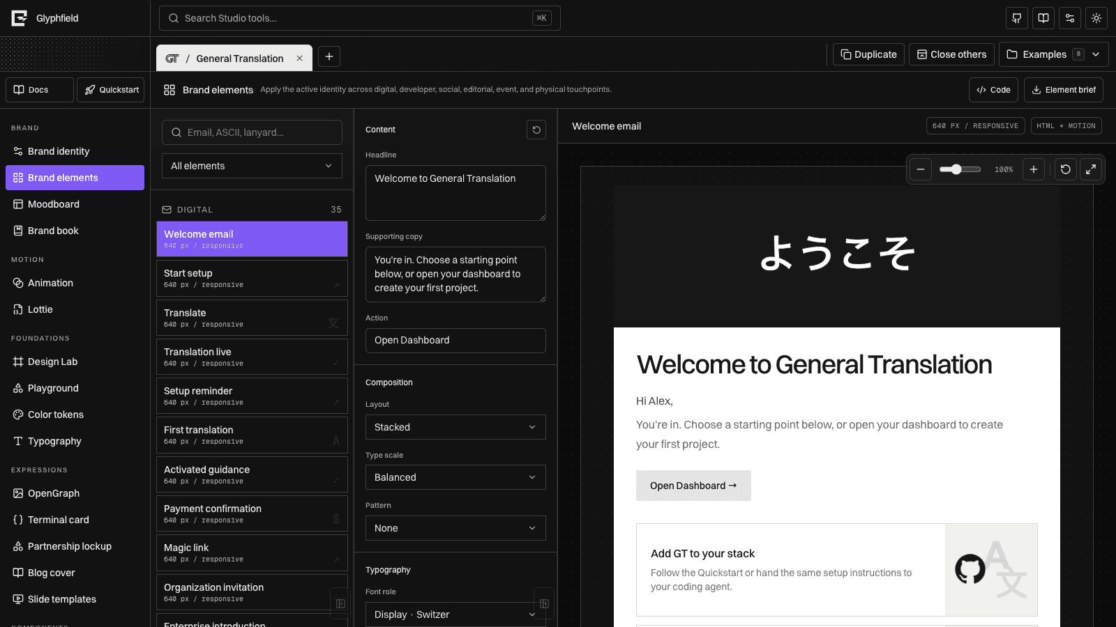
ColorControl | Native swatch, HEX, OKLCH, and optional opacity | Parent owns color; component validates and converts edits | Brand identity, Color tokens, Animation, Design Lab, Brand elements, finishes |
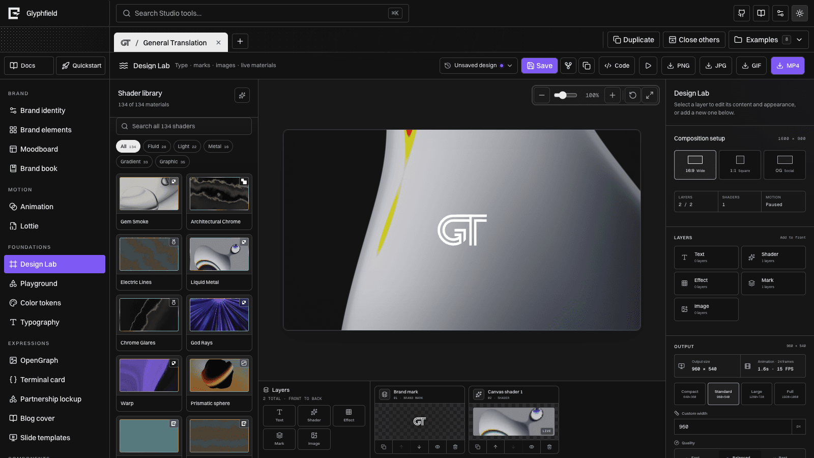
CanvasViewport | Zoom, reset, fit, clipping, pan, and scrollable stage | Persists view state per project and tool | Moodboards, Brand elements, OpenGraph, templates, Design Lab |
EditableCanvasLayer | Selection, drag, resize, keyboard nudge, and selection handles | Parent owns the transform; component owns the active pointer session | Slide, partnership, blog, and expression canvases |
CanvasLayerPanel | Layer selection, order, alignment, disabled actions, and reset | Controlled by the host tool; emits semantic layer operations | Template and slide systems, ready for any layered generator |
SourceCodeDrawer | Right-side source editing, validation feedback, apply, reset, and close | Host supplies the current serialized source and an apply function | Identity, boards, motion, surfaces, templates, foundations, and components |
sourceCode helpers | Parse JSON objects and read constrained strings, numbers, booleans, arrays, and nested objects | Stateless validation helpers | Every source-enabled Studio tool |
canvasDocument | Versioned pages, elements, constraints, resources, history, checkpoints, and export preflight | Immutable scene graph and command history | Migration target for every editable artifact and agent operation |
StudioSelect | Consistent select trigger, popover, keyboard navigation, and value changes | Controlled value | Fonts, assets, materials, layouts, sizes, languages, presets |
MaterialFinishControls | Reflection, shadow, border, glass, and finish presets | Controlled finish object | Animation and logo-material surfaces |
LogoAppearanceControls | Inversion, ordered dither, alpha-aware SVG outline, shadow color, blur, opacity, and offsets | Controlled logo appearance object | Design Lab, OpenGraph, and Brand elements |
useStudioDraft | Project-and-tool-scoped browser persistence | localStorage through one shared hook | Tool fields, zoom, layers, surfaces, layout, and export settings |
usePortableCanvasWorkspace | Canvas serialization and exact autosave lifecycle | CanvasDocument plus IndexedDB/recovery adapter | Design Lab and portable layered workspaces |
studioAutomation | Accessible controls, source round trips, tool actions, and Blob download | Active tool adapter | Every navigable Studio tool |
Color control
ColorControl is one component with optional capabilities rather than separate pickers for every tool.
States
| State | Behavior |
|---|---|
| Resting | Shows the current swatch, normalized HEX, and equivalent OKLCH value |
| Native picker open | Uses the browser color input and publishes the selected HEX value immediately |
| HEX editing | Commits on blur or Enter; invalid input leaves the current color unchanged |
| OKLCH editing | Parses perceptual color input and converts it to the shared HEX storage format |
| With opacity | Adds a zero-to-100-percent range while keeping color and opacity independently controlled |
The conversion functions live in src/lib/color.ts, so the inspector, generated token CSS, and exported graphics use the same normalization rules.
Canvas viewport
CanvasViewport wraps the artifact without changing its intrinsic aspect ratio. The stage scales visually; the export still uses the artifact's declared pixel dimensions.
States
- Default — 100-percent zoom with the artifact centered in a scrollable stage.
- Zoomed out — down to 40 percent for complete-board inspection.
- Zoomed in — up to 200 percent for alignment and edge inspection.
- Reset — selecting the percentage restores 100 percent.
- Fit — restores the stable whole-canvas view.
- Persisted — zoom is stored independently for each brand project and Studio tool.
The shared viewport also supports wheel/trackpad zoom, drag-to-pan on empty workspace, and an explicit original-view reset. These gestures change only the view transform; the artifact document and export geometry remain unchanged.
Source code drawer
SourceCodeDrawer keeps exact source editing adjacent to the canvas instead of moving users into a separate editor route. The component is intentionally controlled:
sourceis the host tool's current serialized document.onApplyparses and validates edits, then updates the host state.- Apply errors appear inside the drawer and do not replace the visual document.
- Reset reloads the current visual snapshot.
- Closing the drawer preserves the active tool and canvas position.
The drawer is a shared interaction shell, not a universal schema. Each tool owns its field constraints and converts valid source into the same state used by its visual controls. Raw Lottie JSON remains a Lottie document; material configuration can carry custom GLSL; template and component drawers expose their own configuration objects.
See Source code editing, Source format reference, and Studio Browser API.
Layers and direct manipulation
EditableCanvasLayer renders the object on the artifact. CanvasLayerPanel renders the corresponding inspector controls. They read and write the same CanvasLayerTransform, so the canvas and inspector never maintain competing position data.
Layer states
| State | Canvas | Inspector |
|---|---|---|
| Idle | No selection box or handles | Alignment and reset are disabled |
| Selected | Selection outline, label, and resize handle | Active row and current scale are visible |
| Moving | Pointer capture updates X and Y in canvas coordinates | The same transform remains the source of truth |
| Resizing | Corner drag updates scale from 0.2× to 3× | Scale percentage updates immediately |
| Keyboard | Arrow keys nudge one pixel; Shift + arrow nudges ten | Selection remains active |
| Reordered | Z-index follows the layer order | Forward/backward controls disable at stack boundaries |
| Aligned | Left, center, right, top, middle, or bottom resolves from artifact geometry | One alignment action updates the selected transform |
| Reset | Returns to the generator's default transform | Row returns to 100 percent |
Nothing is selected automatically. Selection begins only from the layer list or the canvas, matching presentation-editor behavior.
Versioned scene graph
src/lib/canvasDocument.ts defines the portable document model shared by people and agents. It is separate from React component state and records:
- Document schema version, brand binding, capabilities, and revision.
- Pages with dimensions, safe area, bleed, background, notes, and ordered layers.
- Text, image, logo, shape, frame, gradient, texture, shader, video, and reusable-component elements.
- Bounds, rotation, responsive anchors, position/dimension/aspect/rotation locks, visibility, blend mode, border, radius, opacity, and shadow.
- Brand font bindings and text roles.
- Non-destructive image crop, focal point, fit, saturation, dither, grain, blur, posterization, and halation.
- Asset and font references rather than browser-only paths hidden inside component state.
The shared mutation layer currently supports grouped movement, resizing, locking, deletion, direct layer ordering, element updates, and asset replacement. Asset replacement changes only the source reference, preserving geometry, crop, image treatment, effects, and constraints.
History and preflight
commitCanvasChange accepts one mutation or a batch. A batch produces one undo checkpoint, so distribute, align, or multi-select moves reverse as a single action. undoCanvasChange and redoCanvasChange restore cloned documents rather than reconstructing UI state.
Named versions store author, time, note, thumbnail-ready document state, and revision. Restoring a version returns the same scene graph without sharing mutable references.
Export preflight reports:
- Missing asset records.
- Missing font files.
- Elements clipped beyond their page.
- Text exceeding a declared maximum line count.
Direct-manipulation components adapt tool state to this model. Design Lab already serializes the portable scene graph for source, saved designs, autosave, recovery, and agent round trips; other editors can migrate incrementally while preserving their public formats.
Logo appearance
LogoAppearanceControls and src/lib/logoAppearance.ts keep logo treatment consistent across every generator. Preview filters, SVG export filters, and Canvas exports resolve from the same values.
- Invert reverses the current resolved mark without requiring a second uploaded asset.
- Dither applies a non-destructive ordered print field with editable amount, cell size, and direction.
- Outline follows the alpha of the SVG or transparent image instead of drawing a box around its bounds.
- Shadow exposes color, opacity, blur, and X/Y offset.
- Custom color always uses
ColorControl, so HEX and OKLCH stay interchangeable.
These settings are stored per brand and tool. Brand elements apply the same appearance to every logo instance in the selected application.
Shared plugin and provider layer
Third-party packages sit behind local components so individual Studio tools do not need to know each library's API.
| Provider | Local boundary | Used for |
|---|---|---|
| Radix Select | StudioSelect | Accessible popovers, keyboard navigation, focus management |
| Radix Slot | Button | Polymorphic actions and links with one visual system |
| Three.js + React Three Fiber | LiveMaterialCanvas | Live GPU materials and shader rendering |
@shadergradient/react | Live-material adapter | Editable ShaderGradient sphere presets |
@paper-design/shaders-react | LiveMaterialCanvas Paper adapter | 29 Paper shader families and 120 licensed presets in the shared gallery |
| PavelDoGreat WebGL Fluid Simulation | Local fluid adapter | MIT-licensed GPU advection model used by Fluid Energy |
gifenc | GIF export pipeline | Deterministic browser GIF encoding and palette control |
mediabunny | Browser video/audio muxing | MP4 export and Animation audio mixing |
@lottiefiles/dotlottie-web | Animation source adapter | Local .lottie and Lottie JSON playback and exact frame seeking |
| PrismJS | Code-highlighting adapter | TypeScript, Python, Bash, JSON, and shell token color |
| Lucide | Component-local icons | Consistent semantic control icons |
gt-next | <T> and useGT | Translatable Studio labels and accessible names |
| Fumadocs | Docs shell and MDX source | This documentation system, search, navigation, and generated pages |
GSAP and Lenis are reserved for the marketing experience; editor manipulation uses pointer events and deterministic transforms so canvas behavior stays direct and exportable.
Building another generator
- Store tool fields with
useStudioDraft(identity.id, tool.id, field, initialValue). - Use
ColorControlfor all editable colors and opacity. - Wrap the artifact in
CanvasViewportand preserve its declared aspect ratio. - Represent every movable object with a
CanvasLayerTransform. - Pair
EditableCanvasLayerwithCanvasLayerPanelwhen an artifact has multiple selectable objects. - Use
StudioSelect, shared buttons, upload fields, and range controls instead of native one-off styling. - Build exports from the same resolved settings that drive the preview.
- Serialize the editable state and mount
SourceCodeDrawerso advanced edits round-trip through the same validators and state setters.
This boundary keeps a new tool visually native to Glyphfield while leaving its artifact renderer free to be SVG, Canvas, HTML, or WebGL.