 Glyphfield
Component library
Review interactive product patterns across actions, forms, navigation, feedback, data, and cards.
The Component library applies the active identity to interface patterns, making product UI part of the brand system rather than a separate visual language.
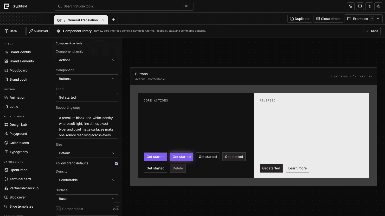
Families
- Actions — default, rainbow, outline, secondary, ghost, destructive, and reversed buttons
- Forms — text fields, select controls, checkboxes, settings rows, and submission actions
- Navigation — product navigation, breadcrumbs, and tabs
- Feedback — success and error alerts, progress, and notifications
- Data — metrics and responsive data tables
- Cards — pricing, testimonial, and product cards
Controls
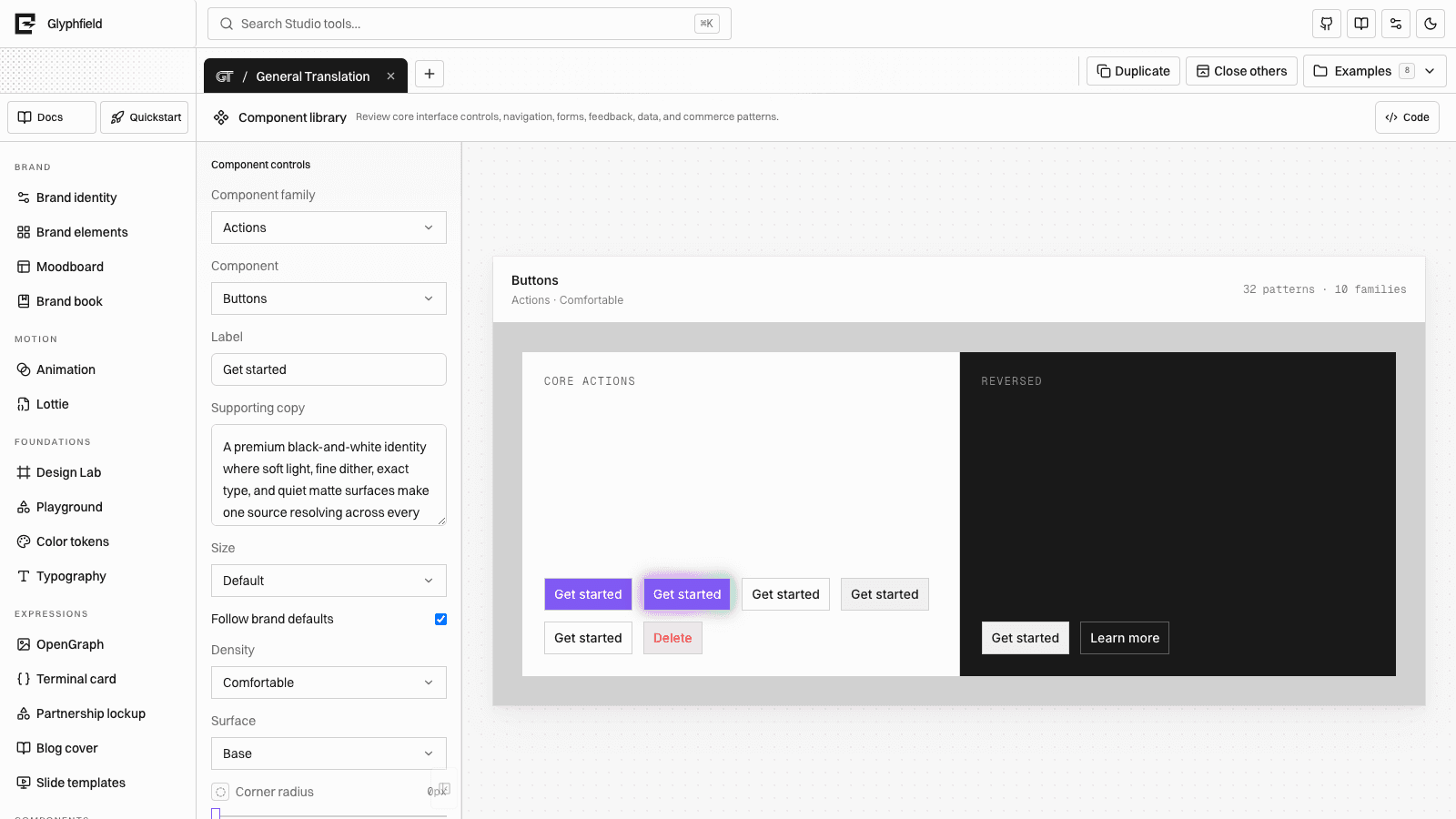
Choose a family, edit the primary label, switch sizes, and inspect disabled states. The component sheet follows Studio light/dark mode while retaining identity typography.
Product components in Brand elements
The Component library is a broad system sheet. Brand elements contains 14 individually configurable production applications such as a navigation bar, hero, pricing card, command menu, modal, toast, data table, checkout, and settings panel.
Use the library to review consistency. Use Brand elements when you need a specific component brief and per-application composition controls.
Both surfaces expose exact configuration through Code. Component library source controls the selected family, label, size, state, and identity-bound presentation. Brand elements source contains the selected application override rather than the entire catalog, so applying a change updates only that production artifact.
Editor components
The interface that edits these outputs is also a component system. Color input, canvas zoom, layer selection, direct manipulation, alignment, material finishes, selects, buttons, and browser persistence are reusable primitives rather than tool-local implementations.
See Editor systems and plugins for each component's states, state owner, reuse map, and third-party provider boundary, or Source code editing for the shared drawer workflow.